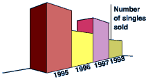
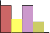
3-D Bar chart vs. 2-D Bar Chart
A 3D bar chart might look very attractive, but it is often quite misleading. Note the 3-D bar chart on the left below, because of the perspective it looks as though the sales for 1995 were far greater than those for any other year. In fact they were identical to those for 1997. It would be much better to draw a 2D bar chart.
Presentation Bias Evaluation Worksheet:
The following list of questions help us work through potential presentation bias in a study:
Presentation Bias - is the study presented in a way that could be easily misinterpreted?
- Do graphs and tables present data accurately?
- Are study findings and implications clearly couched within the significant shortcomings or limitations of the study?
- Is there any other reason to believe that the author's presentation could be misleading
Overall assessment of presentation bias: _____ Low _____Moderate ____High
Explain:
Have I Grasped the Key Concepts Here?
Check the correct answers for question 2&3 below:
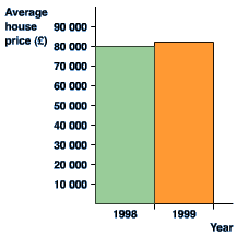
Key to question #2:
from this graph it looks as though house prices have tripled in one year! It is misleading because the vertical axis does not start at 0. Look at the 'improved' version of the same graph. This gives a much more accurate picture of what has happened. Corrected graph should look like below:
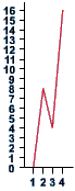
Key to question #3:
Although the vertical scale starts at 0, it does not go up in even steps. This has the effect of distorting the graph, and making it look as though the biggest jump is between 1 and 2 rather than 3 and 4. Also, there are no labels on the axes. We have no idea what this graph represents! If the scales are correct, the graph should look like below: