Presentation Bias
If you have collected, managed, entered, analyzed and interpreted your data without introducing error, your conclusions will reflect the reality of your sample. However, you may still introduce error in your presentation of those results. That is, the audience to whom you are communicating your results may draw the wrong conclusions from your presentation.
Sometime presentation bias is unintentional. However, the most infamous examples of research error are presentations which have the appearance, at least, of deception. Commonly, graphs and charts are misleading. Other times it is the statistics themselves. Below are some examples (Examples 1-5 are from www.truthpizza.org/logic/stats.htm. Example 6 is from mediamatters.org/items/200509210010)
Statistics can be misleading...
Statistics can be misleading even when they are true. In some ways, this can be considered interpretation bias if the researcher is drawing conclusions unwarranted by the research. However, if data are presented without interpretation, yet a misleading interpretation by the reading is likely, we should consider this presentation bias. Below are some examples:
1. I once heard a statistic that the rate of teenage pregnancy in a conservative religious group was higher than the national average. This seemed surprising until it became apparent that the reason wasn't a high percentage of unwed mothers - it was a high percentage of women got married while still in their teens.
2. I recall hearing apparently conflicting claims about employment during a presidential election campaign a number of years ago. The challenger claimed that unemployment was up during the President's term in office. The President's campaigners said that employment was up! It turns out that both were true. The population had increased, and it turned out the number of people who were employed and the number of people who were unemployed had both increased.
3. When someone wants to use statistics to make a point, there are many choices of just what numbers to use. Suppose we want to dramatize how much the price of candy bars has gone up. We might have the following data:
January $ .76
February $ .54
March $ .51
April $ .63
May $ .80
June $ .91
July $ .76
We could correctly say that the price jumped from 51 cents to 91 cents in only three months (March to June), an increase of more than 78%! On the other hand, we can see it didn't change at all from January to July, which we might avoid mentioning if we wanted to impress people with the price increase. Choosing the starting and ending points for data used is an easy way to deliberately manipulate statistics.
4. Sports announcers always want to inject as much excitement as possible into the games they announce, so they will find any way they can to make what happens into some kind of a record. We often hear things like "That give him the team record for most yards gained from scrimmage by a running back in the first quarter." Players on other teams may have gained more, players who weren't running backs might have gained more, players may have gained more in other quarters, and players who weren't starting from scrimmage (as when returning kicks) may have gained more. Other players presumably have the records for all of these. With so many qualifiers available, sportscasters can concoct some impressive facts for almost any game we watch.
5. Sometimes statistics are given in absolute terms and other times they are given in percentages. We might hear that Blanko Corp. laid off 32 people or we might hear that they laid off 25% of their workforce. Typically a news source will try to make the number sound as dramatic as it can, so if Blanko is a huge company - say it has 200,000 employees - the source might find it more impressive to say it laid off 20,000 people rather than 10% of the workforce. If Blanko is small, say 100 employees, it sounds more impressive to say they laid off 10% rather than just 10 people. Which figure we should prefer as responsible thinkers depends on why we care about the information. If we are worried about the effect on the community or the country, then perhaps we should figure out the percentage of the population affected, rather than the absolute number or the percentage of company employees. If Blanko cuts 500 people from a town of 10,000, that is a huge effect, while if they are in a city of two million it may not be too important. If I had stock in Blanko, I'd be more interested in how the cut compared to their overall workforce.
6. During The O'Reilly Factor, O'Reilly aired a clip of Clinton's interview on the September 18 edition of ABC's This Week, in which Clinton argued that Republicans are not committed to reducing poverty. O'Reilly then informed his audience that the poverty rate in 1996 was higher than the poverty rate in 2004. While this assertion on its face is accurate, his comparison obscured the more relevant fact that the poverty rate declined every year of the Clinton presidency and has increased every year under the Bush presidency. During Clinton's tenure, the poverty rate fell from 15.1 percent in 1993 to a low of 11.3 percent in 2000; it has risen every year that Bush has been in office, from 11.7 percent in 2001 to 12.7 percent in 2004.
Charts and Graphs can also be Misleading.....
Charts and Graphs can also be misleading even when they are true. See the examples below.
Think about the above practice problems for a few minutes, then check the answers below...
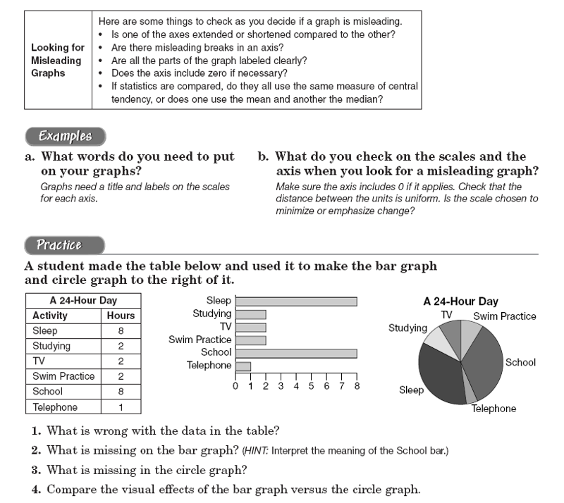
1. What is wrong with the data in the table? The total hours should add to 24 hours, but it only adds to 23 hours.
2. What is missing on the bar graph? There is no title for the graph and no labels on both axises.
3. What is missing in the circle graph? In the circle graph, the size of the pie should be labelled.