Lesson Eight
Bias
After successfully completing this lesson, you should be able to:
1. List and describe various types of bias in research studies.
2. Identify types of bias given a research study.
Most research is intended to better understand a problem so that is can be reduced or eliminated. If we have errors in our research, it will slow our progress - and may even make things worse!
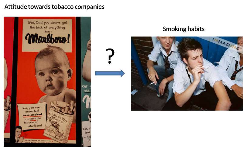
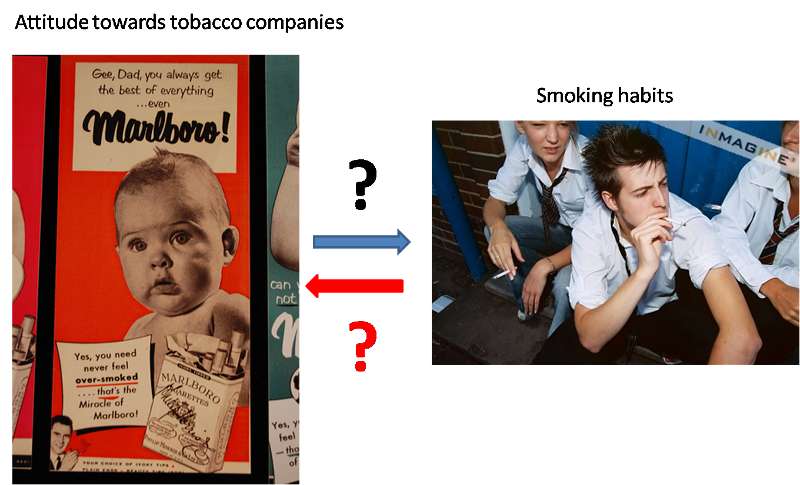
Consider a research study on how high school students' attitudes about tobacco companies relates to their smoking habits.
The research findings might suggest one of the two following outcomes:
If we believe #1 is true, then we might seek funding to include information on tobacco company deception in our anti-smoking program. If we believe #2 is true, we will drop the issue and move on to something else.
Of course, believing something is true doesn't make it true. Reality and our research findings may or may not agree. One way to view this is pictured in Figure 1.
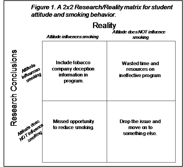
In the upper-left box, both reality and our research findings agree that attitude influences smoking behavior. We can be pleased when this happens because we have a better idea how to go about reducing smoking. In the lower-right box both reality and our research findings agree that there is no relationship. We can also be somewhat pleased with this since we now know that we can use our time and money on other, more productive interventions.
However, the upper-right box is a problem. Our research suggests that attitude influences smoking but it really doesn't. This is a problem because we may now spend time and money on developing an intervention based on tobacco company deception, even though it will not have any effect on smoking. This is time and money that could have been spent on effective interventions. Similarly, the lower-left box is a problem because attitude really does influence smoking behavior yet our research suggests that it doesn't. In this case, we have missed an opportunity to reduce smoking. A number of lives may end prematurely because we failed to find an association that was really there.
We can generalize this in Figure 2. Whatever the outcome of our research, we would like to end up in the upper-left or lower-right boxes. A research result that shows an association is called a "positive" result, similar to a blood test that shows someone to be "positive" for a disease. Thus, we call the upper-left box a "true-positive." Similarly, the lower-right box is a "true-negative."
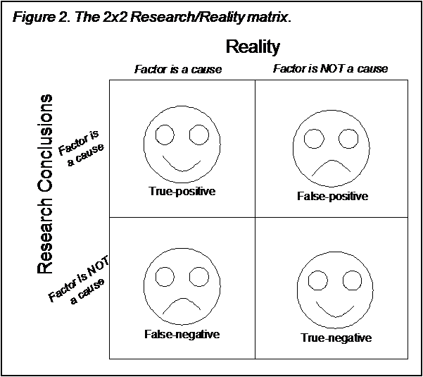
On the other hand, the upper-right box is a "false-positive" because the study results were positive, but the reality is something different - that is, the results were "false." Similarly, the lower-left box is known as "false-negative." There is always a price to pay for false-positives and false-negatives. The price of a false-positive is generally wasted time and money on an ineffective intervention. The price of a false-negative is a missed opportunity to reduce a problem. In some research, these prices might be quite small. In other research, where people's lives depend on the outcome of the research, the price can be extremely large.
Research error is what causes us to end up either in the false-positive or false-negative box. Thus, it is important for us to understand the sources of research error and how to minimize them.
Bias is just error that occurs in a non-random way (random error - or "chance" - is covered in the next chapter). It does not imply that the research is prejudiced or malicious, only that something interferes with the validity of the research. Valid research should progress through the following steps:
These steps are reflected in the figure below. Error, in the form of bias, can enter the study at any one of these steps. We will explore potential bias at each step.
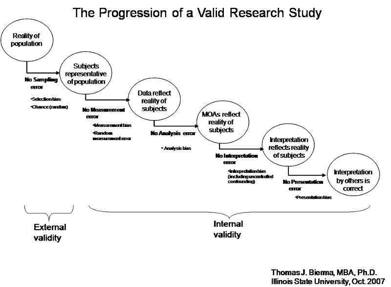
In any research, there is a population of interest - the largest group that you want to understand. For example, if you are trying to improve the anti-smoking program in your high school district, your population of interest is high school students in your district. If you are trying to improve the water quality of streams and rivers in Illinois, your population of interest is all rivers and streams in Illinois.
In any population, there is a certain reality that you want to understand. For example, the reality of your high school population may be that "trusting the tobacco industry dramatically increases your likelihood of smoking." Similarly, there is a reality for streams and rivers in Illinois. Perhaps the presence of a farm field tile drain increases the pesticide concentration in the receiving stream.
However, there is rarely the time or resources to research the entire population. Instead a sample of the population must be chosen and researched. If this sample is representative of the entire population, then the reality of this sample will be the same as the reality of the population, and we will come to the correct conclusion in our research (assuming we have not other sources of error). However, if the sample is biased , then the reality of the sample will not be the same as the reality of the population, and what we learn from the sample will not help us understand the population. In fact, it could mislead us about the reality of the population and cause us to waste time and money on interventions that will never work, or miss opportunities to solve the problem.
Convenience samples are made up of those subjects that were easiest for the researcher to access. For example, in the anti-smoking research, a convenience sample would be the wellness class that the researcher is currently teaching. In stream research, a convenience sample might be the rivers and streams that are within a 1-hour drive of the researcher's home. It is not hard to image ways in which a convenience sample may not be representative of the population. For example, the wellness class might be taken only by freshman, or the streams within a one-hour drive may flow through farm land that has a higher clay content than the rest of the state. This does not necessarily bias results. A convenience sample will bias results only if a factor that makes the sample non-representative is also related to the relationship being studied. For example, if the relationship between smoking and attitudes about the tobacco companies varies by age, then using the wellness class taken by freshman as a sample of the entire high school district population will produce a biased result. Similarly, if clay retains pesticides better, then the relationship between field tile drains and stream water quality will be different in this sample than the rest of the state.
Volunteer (or self-selection) bias is another form of selection bias. This occurs when subjects can choose whether or not to participate.

If those more likely to participate exhibit a different relationship between the variables under study, then the sample is biased. For example, if students in one high school were asked to volunteer to take the survey about tobacco companies and smoking, it is likely that only a minority of students would volunteer. Who are they likely to be? Perhaps those who feel most strongly about the issue - non-smokers who hate the tobacco companies and smokers who feel the tobacco companies have gotten a bad wrap. This sample would tend to produce a much stronger relationship between these variables than would be true for the population as a whole. In the case of stream research, we would not have volunteer bias, since streams can't "volunteer" for the study. However, if a key to sampling the stream was to get permission from a farmer to use his/her land, then volunteer bias might apply.
Volunteer bias is extremely common in studies of humans, since it is usually not possible to force people to participate. In each case one must judge how much bias may have been introduced. In surveys, one should ideally obtain better than an 80% response rate. Response rates under 50% should be highly suspect, since a majority of people have reasons why they are not participating. The likelihood that one or more of these reasons is related to the relationship under study is fairly high.
A classic example of a biased sample and the misleading results it produced occurred in 1936. In the early days of opinion polling, the American Literary Digest magazine collected over two million postal surveys and predicted that the Republican candidate in the U.S. presidential election, Alf Landon, would beat the incumbent president, Franklin Roosevelt by a large margin. The result was the exact opposite. The Literary Digest survey represented a sample collected from readers of the magazine, supplemented by records of registered automobile owners and telephone users. This sample included an over-representation of individuals who were rich, who, as a group, were more likely to vote for the Republican candidate. In contrast, a poll of only 50 thousand citizens selected by George Gallup's organization successfully predicted the result, leading to the popularity of the Gallup poll.
Another classic example occurred in the 1948 Presidential Election. On Election night, the Chicago Tribune printed the headline DEWEY DEFEATS TRUMAN, which turned out to be mistaken. In the morning the grinning President-Elect, Harry S. Truman, was photographed holding a newspaper bearing this headline. The reason the Tribune was mistaken is that their editor trusted the results of a phone survey. Survey research was then in its infancy, and few academics realized that a sample of telephone users was not representative of the general population. Telephones were not yet widespread, and those who had them tended to be prosperous and have stable addresses. (In many cities, the Bell System telephone directory contained the same names as the Social Register.) In addition, the Gallup poll that the Tribune based its headline on was over two weeks old at the time of the printing.
Once a sample is selected, an attempt is made to collect data (e.g., through interviews or questionnaires) from all of its members. In practice, researchers never obtain responses from 100% of the sample. Some sample members inevitably are traveling, hospitalized, incarcerated, away at school, or in the military. Others cannot be contacted because of their work schedule, community involvement, or social life. Others simply refuse to participate in the study, even after the best efforts of the researcher to persuade them otherwise.
Each type of nonparticipation biases the final sample, usually in unknown ways. In the 1980 General Social Survey (GSS), for example, those who refused to be interviewed were later found to be more likely than others to be married, middle-income, and over 30 years of age, whereas those who were excluded from the survey because they were never at home were less likely to be married and more likely to live alone (Smith, 1983). The importance of intensive efforts at recontacting sample members who are difficult to reach (e.g., because they are rarely at home) was apparent in that GSS respondents who required multiple contact attempts before an interview was completed (the "hard-to-gets") differed significantly from other respondents in their labor force participation, socioeconomic status, age, marital status, number of children, health, and sex (Smith, 1983).
The response rate describes the extent to which the final data set includes all sample members. It is calculated as the number of people with whom interviews are completed ("completes") divided by the total number of people or households in the entire sample, including those who refused to participate and those who were not at home.
Whether data are collected through face-to-face interviews, telephone interviews, or mail-in surveys, a high response rate is extremely important when results will be generalized to a larger population. The lower the response rate, the greater the sample bias. In general, data from mail-in surveys with return rates of 20 or 30 percent, which are not uncommon for mail surveys that are not followed up effectively, usually look nothing at all like the sampled populations. This is because people who have a particular interest in the subject matter or the research itself are more likely to return mail questionnaires than those who are less interested.
One occasionally will see reports of mail surveys in which 5 to 20 percent of the sample responded. In such instances, the final sample has little relationship to the original sampling process. Those responding are essentially self-selected. It is very unlikely that such procedures will provide any credible statistics about the characteristics of the population as a whole.
The use of appropriate sampling methods and an adequate response rate are necessary for a representative sample, but not sufficient. In addition, the sample size must be evaluated.
All other things being equal, smaller samples (e.g., those with fewer than 1,000 respondents) have greater sampling error than larger samples. To better understand the notion of sampling error, it is helpful to recall that data from a sample provide merely an estimate of the true proportion of the population that has a particular characteristic. If 100 different samples are drawn from the same sampling frame, they could potentially result in 100 different patterns of responses to the same question. These patterns, however, would converge around the true pattern in the population.
The sampling error is a number that describes the precision of an estimate from any one of those samples. It is usually expressed as a margin of error associated with a statistical level of confidence. For example, a presidential preference poll may report that the incumbent is favored by 51% of the voters, with a margin of error of plus-or-minus 3 points at a confidence level of 95%. This means that if the same survey were conducted with 100 different samples of voters, 95 of them would be expected to show the incumbent favored by between 48% and 54% of the voters (51% ± 3%).
The margin of error due to sampling decreases as sample size increases, to a point. For most purposes, samples of between 1,000 and 2,000 respondents have a sufficiently small margin of error that larger samples are not cost-effective. We will revisit the concept of margin of error in Lesson 9 - Chance.
The following are a list of questions that help us work through potential sampling bias in a study:
Sampling Bias - are the subjects representative of the target population?
Overall assessment of sampling bias: _____ Low _____Moderate ____High
Explain:
Once you have a sample of subjects, you must measure your variables of interest. This can be very simple or quite complex. No measurement is perfect, and efforts must be taken to minimize error. If no error occurs, then your data will reflect the reality that is happening in your sample. If error occurs, your data will present a picture of reality that is different from what is truly happing in your sample.
Instrument bias results from imperfections in the instrument or method used to collect your data. For example, in analyzing for pesticides in water samples taken from the stream, a fairly complex process may be required to extract the pesticides from the water and then analyze them. Errors in the extraction process can cause loss of some pesticide. Equipment must be regularly maintained and calibrated. Failure to do this can produce results that are either too low or too high.

Similarly, the survey instrument used to collect information on student's beliefs about tobacco companies may be biased. A concept such as "the truthfulness of tobacco companies" is complex. What are the appropriate questions to ask to accurately assess this? On what sort of scale should responses be taken? The validity of data collection instruments is a common source of uncertainty in interpreting research involving humans.

Researcher bias can be introduced when the researcher's judgment is involved in the measurement process. For example, if one is studying the relationship between marital status and depression, a doctor may be required to make the diagnosis of depression. If the doctor is also aware of the patient's marital status, this knowledge may influence the doctor's judgment. For this reason, a "blind" research format is sometimes used, where the doctor is kept unaware of possible causal factors (such as marital status) and perhaps even the entire purpose of the research study, when making the diagnosis.
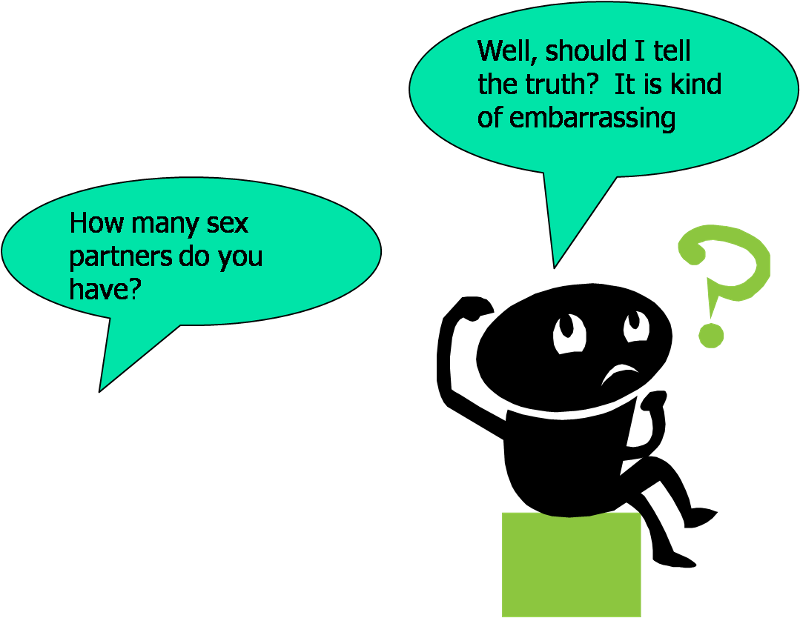
Respondent bias can result when the respondent is motivated to answer in any way other than the truth. For example, if the respondent feels ashamed of the truthful answer, they may answer untruthfully. This is particularly problematic with topics such as sex or drug use. The respondent may also answer untruthfully if they believe one answer is preferred by the researcher.
Testing bias occurs when the very act of studying subjects changes their reality. The most famous example of this is known as the Hawthorne Effect - named for the Western Electric Hawthorne Plant in Chicago where research was being conducted on various management practices and subsequent worker productivity. It was found that worker productivity improved in all groups, even where management practices were not changed. The reason is that the very act of studying the workers made them feel that management was interested in them and they became more satisfied with their jobs - working more productively. Testing bias is a common concern in pretest/post-test studies, where taking the pretest may alter a subject's interest in the topic, altering their subsequent results on the post-test.
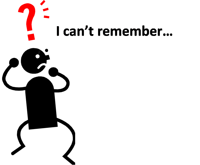
Recall bias may occur when subjects are asked about past events. Subjects may have either imperfect recall, resulting in random errors (see below), or be more likely to provide a particular response (systematic recall bias). An example of random recall bias might be the amount of liquid consumed each day in a study of the relationship between daily liquid consumption and blood pressure. People's recall for their liquid consumption may high or low with equal likelihood. An example of systematic recall bias suggested by Rothman (1986) could occur in a study of birth malformations and their possible link to maternal medical or chemical exposures during pregnancy. Mothers who have had a malformed baby may have spent a lot of time thinking about prenatal exposures and therefore be more likely to recall them. Thus, a finding that mothers who had malformed babies were more likely to have prenatal exposures may be due solely to their greater ability to recall these exposures.
The following are a list of questions that help us work through potential measurement bias in a study:
Measurement Bias - do the data from the subjects accurately reflect their reality?
Overall assessment of measurement bias: _____ Low _____Moderate ____High
Explain:
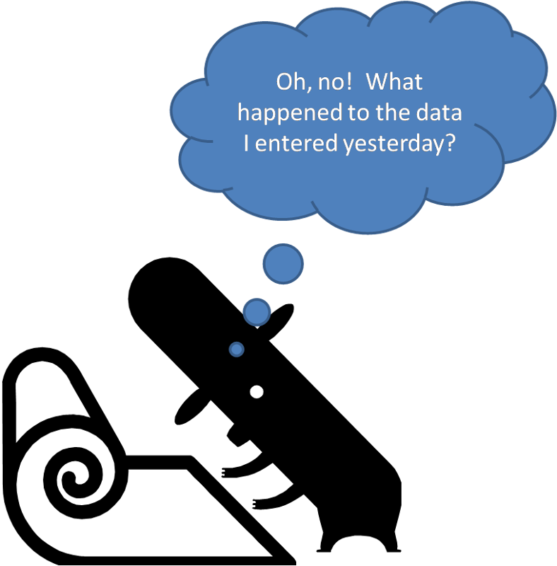
If you have collected data on your sample without introducing measurement bias, your data will reflect the reality of your sample. However, errors can be introduced during the management, entry, and analysis of your data.
Errors occurring during data management and entry are easily overlooked by researchers. However, such errors are not uncommon. Depending on the type of research, raw data may be in the form of hand-written surveys, "op-scan" sheets, laboratory or field notes, etc. If not carefully managed, these documents can be misplaced or mis-categorized. Since most data analysis is performed on computer, the data must be entered into the computer in some form. Data entry can produce significant errors. Some researchers minimize this by actually having two people enter the same data and then comparing the two datasets for differences. Op-scan sheets, or survey's taken on-line, can reduce (but not eliminate) data entry errors. In any case, the researcher should always examine frequency distributions for each variable before beginning data analysis in order to identify any obvious data errors (indicated as outliers).
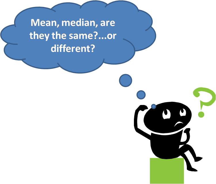
Statistical bias results from using the incorrect statistical analyses. The most common form is using a statistical technique even when conditions ("assumptions") necessary for valid use of the technique are violated. For example, when a quantitative variable has a highly skewed frequency distribution, the median is a better way to summarize the data than the mean - since the mean can be greatly distorted by extremes in the data. If the data were analyzed by comparing means instead of medians, the results would be misleading.
Analysis Bias - is the data analysis appropriate given the research question?
Explain:
"Frogs when deprived of all legs become deaf.".
There once was this mad scientist. One day, he wanted to determine how far a frog can jump. So he got a frog and commanded it to jump. At once the frog jumped. The scientist measured and wrote in his journal: frog with four legs jumps 8 feet. Then he cut off the two front legs of the frog. He commanded it to jump. The frog struggled a bit but managed to jump. He wrote in his journal: frog with two legs jumps 3 feet. Once more he cut off the other two legs. He commanded the frog to jump but it just sat there. Then the scientist wrote: Frogs when deprived of all legs become deaf.

Lesson learned from the comic:
How should we interpret the study result: frogs failed to jump when deprived of all legs? To us, it is obviously a cause-effect relationship where deprived of all legs is the cause and fail to jump is the effect/outcome. But the mad scient interpret as frogs when deprived of all legs become deaf and therefore could not hear the command, consequently they could not jump. In another word, deaf is the cause of failing to jump. It is clearly a wrong or biased interpretation of the observation. Unfortunately, in many real-life research studies, biased interpretation of the study results are not so obvious to spot, yet it is one of the major cause of error in a research study.
If you have collected, managed, entered, and analyzed your data without introducing error, your statistical results will reflect the reality of your sample. However, you may still introduce error in your interpretation of those results. In some cases, the errors are introduced from weaknesses in the study design. Others occur only when trying to draw conclusions about the true causal connection between the variables of interest. Interpretation bias usually result from:
Let's now discuss each one from the above list.
Lack of an adequate control group is a common bias. To understand the role of one variable in causing another, one would like to study subjects who are identical in every way except for the two variables under study. For example, in studying whether swimming in a park pond was responsible for an outbreak of illness, one would like subjects who are identical in every way except some swam and some didn't, and some became ill and some didn't. Similarly, in studying how attitudes about tobacco companies affects smoking behavior, one would like subjects with a wide range of attitudes about tobacco companies and a wide range of smoking behavior, but identical in all other respects. If the subjects are not identical in every other way, then it may be possible that these differences may be the cause of any apparent associations. In fact, most of the remaining biases relate, in one way or another, to lack of an adequate control group.
Of course, having a perfect control group is impossible. Instead, one must judge the extent the control group is inadequate, and the extent to which the researchers used appropriate statistical methods to adjust for this. In order to identify the potential problem of "Lack of an adequate control group", it is very helpful to ask ourselves this question:" is it possible to conclude what happens in the absence of the "causal" factor?".
Now let's look at a few examples and how asking the above question can help us:
Example #1:
"Pickles Will Kill You" - Every pickle you eat brings you closer to death. Pickles are associated with all the major diseases of the body. Eating them breeds wars . They can be related to most airline tragedies. Auto accidents are caused by pickles. Above conclusions are supported by the following facts/statistics:
Eat orchid petal soup. Practically no one has as many problems from eating orchid petal soup as they do from eating pickles.
Now let's think through the above example. For each of the statistics listed above, let's ask the questions: "Is it possible to conclude what happens if people haven't eaten pickles?", you will find that we either can not conclude anything or the conclusion does not support the interpretation:
Example #2:
"It is safer to drive under influence" Driving under influence will protect you from injury. Above conclusion is based on the following statistics show below:
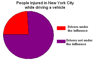
From the chart shown above, more than three quarters of injuries happened when drivers are not under the influence and only less than a quarter of the injuries happened when drivers are under the influence.
Now let's ask the questions: "Is it possible to conclude what happens had people not been under the influence?", It is impossible to know whether people will or will not get injured had they not been under the influence.
History bias can occur when one is studying changes in subjects over time. Sometimes events occur during the study period that can affect the dependent variable. For example, in studying whether safety training improves workplace safety, one might provide safety training to one group of workers but not another, and then follow both groups for a year to see how many injuries occur. A lower injury rate among trained workers (RR<1) would indicate that training reduced the risk of injury. However, one serious injury in the workplace during the study period might also reduce the subsequent risk of injuries for others, as they might become more vigilant about safety. If both groups are not equally exposed to information about the serious injury, it could affect one group more than the other, producing an incorrect measure of association between training and injury. If the injury occurred among the trained workers, and the untrained workers were in a remote part of the plant, the impact of the injury would be greater among trained workers, exaggerating any association between training and injury. On the other hand, if the serious injury occurred among untrained workers, the bias could actually cover up an association between training and injury.
Now let's look at a couple of examples here:
Example #1:
"Dentists Beware!" - Young people who become dentists to earn money and serve the public should consider another factor. Dentists work in an environment that can be detrimental to their health. A recent study of dental students at a university found they suffered a significant loss of hearing within three years of using high speed drills. These instruments reduce a patient's pain but gradually turn some dentists deaf or impair their hearing. The researchers recommend that dentists wear earmuffs or plugs on the job.
Was it the sound of the drilling that led to the significant hearing loss among the dental students over the three year time span of this study? Maybe it was. Maybe not. It is possible that other activities or events involving the dental students during the three-year period of this study that may have been the true cause of the hearing loss. For example, suppose the dental students - who as a group are not very wealthy at that point in their professional careers - did not eat very many well-balanced meals while in dental school. Were this to be the case, as it probably is, then poor diet could be the true cause of hearing loss. It is also plausible to assume the dental students took jobs during the summer months to help pay for the expenses incurred by attending expensive dental school. And further suppose that some of the students were working on ground crews at the airport terminal or with a jackhammer breaking up cement sidewalks. Might not these noisy activities be the true cause of the hearing loss, rather than the drilling in the dental office?
Example #2:
"Stop Signs" - Inadequate planning has led to overwhelming traffic problems in both large and small cities throughout China. Since accidents were increasing every year, a study was undertaken to determine whether Chinese driving behavior could be modified by external cues. In this case two different designs of stop signs were used (see below). The first set of observations included1440 drivers, of whom 820 did and 620 did not use a turn signal upon encountering the yellow stop sign. Then the researchers changed the yellow stop sign into red stop sign at the same intersections, further data collection showed 1048 drivers indicating turns and 494 not doing so. If you were in China, would you feel safer as you approached an intersection with red stop signs?

I would not feel the least bit safer! In this case, the potential history bias must taken into consideration. A series of bad accidents between the pre- and post observations might have led to a temporary change in driving behavior that was unrelated to the stop signs. Other aspects of the history might include such things as the weather or a national holiday.
Causal direction bias occurs when the true direction of causality between two variables is opposite to that assumed by the researcher. For example, in our study of whether students' smoking behavior is affected by their attitude about tobacco companies, we might find that these two variables are strongly associated. We might conclude from this that attitude affects smoking behavior and begin a program to alter these attitudes. However, it is possible that the direction of causation is just the opposite - that smoking behavior altered students' attitudes about the tobacco companies. In fact, cognitive dissonance theory would suggest that this is a real possibility. Once addicted to nicotine, smokers may find it hard to reconcile their continued smoking with revelations about how tobacco companies deceived them. Cognitive dissonance theory suggests that one way to reduce this conflict is to adopt attitudes that are consistent with one's behavior. Thus, smoking caused the attitude, not the other way around. The best way to minimize causal direction bias is measure the variables over time - this will clarify which variable changed first.
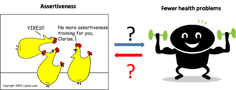
Another research study examined the relationship between assertiveness and health problems with the hypothesis that one's health problems will be affected by one's assertiveness. The researchers surveyed workers in the mental health and mental retardation settings in Northeastern Pennsylvania and found that highly assertive individuals were found to experience few health problems than were individuals low in assertiveness. Researcher concluded that assertiveness affects health and suggest that programs designed to reduce health problems should encourage development of assertiveness training. However, it is possible that the direction of causation is just the opposite - that one's health status altered one's assertiveness. An individual who experiences fewer health problems feels better and is more likely to be confident and assertive.
Uncontrolled confounding is the affect of a third variable that is related to the two variables under study. This relationship can alter the apparent relationship between the variables under study. For example, if one studied the relationship between reading ability and body weight among grade school children, there is no scientific reason to expect increased body weight to cause improved reading ability. However, such a study would certainly find a strong association. The reason is a major confounder - age. Increased age causes both improved reading ability as well a greater body weight. Failing to account for the confounding effects of age would produce a misleading association between body weight and reading ability (and possibly lead to some interesting dietary interventions!). Confounding is such an important potential source of research error that is discussed in greater detail in a special section at the end of this lesson.
Assume you are investigating the relationship between exposure E and disease D. Let us also assume that these two variables are related with a true relative risk (RR) of T. Remember, study results that deviate from T increase the likelihood that you will make an erroneous conclusion (false positive or false negative). A confounder is a variable which, if you don't do something about it, will cause the observed RR to deviate from T through a very specific mechanism.
The mechanism by which a confounder causes a deviation from the true RR is by being both:
1. A risk factor (cause or indicator of a cause) for the disease in question, and
2. Associated (causally, by chance, or otherwise) with the exposure of interest.
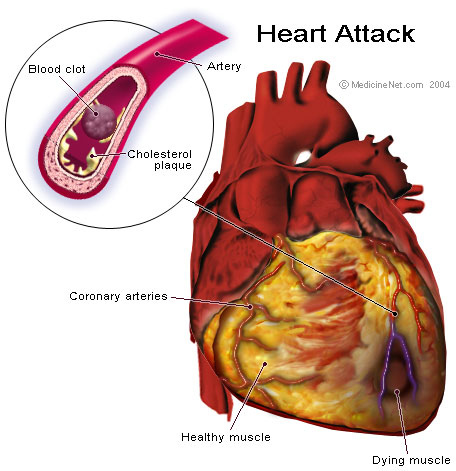
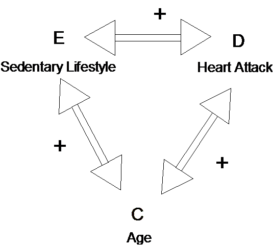
Let's look at some examples. You are examining the relationship between heart attacks and a sedentary lifestyle. You interview a number of people who recently had heart attacks and a similar number of controls without heart attacks. From your questions, you determine whether they have had a sedentary lifestyle during the last 6 months. You find that those with heart attacks were twice as likely to be sedentary, suggesting that a sedentary lifestyle might increase one's risk of a heart attack. Can you think of a potential confounder? How about age? It seems plausible that age contributes to a heart attack (risk factor for the disease) and it is also plausible that age could be associated with a sedentary lifestyle (older people are more likely to be sedentary). The observation that those without heart attacks were less likely to be sedentary could simply be because people without heart attacks are younger. In this case a conclusion that a sedentary lifestyle increases the risk of a heart attack would be in error (false positive).
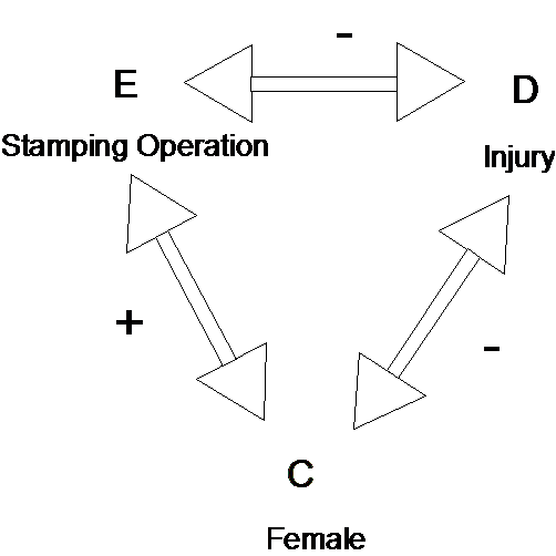
You are examining the relationship between the risk of accidents and working in one of two manufacturing processes within a plant, one of which involves a large number of stamping operations. You find that the rate of accidents (per 100 employees) is about the same at the two processes and you conclude that the stamping operations are no more risky that the non-stamping operations. However, it is plausible that, for whatever reason, women may be less likely to be injured than men performing the same task (being male is a risk factor for injury). If there are more women than men in the stamping operation, this may be masking the association between the operation and risk of injury (stamping may appear no more risky simply because more females are involved). If gender were acting as a confounder in this way, you would have made an error concluding that stamping is no more risky (false negative).

The best way to identify potential uncontrolled confounders in a study is to follow two steps. First, simply think of other risk factors for the disease or problem. In the accident case above, this might include age, hours of safety training, amount of overtime worked, etc. Second, identify factors from among this list that could plausibly be related to the independent variable of interest. For example, amount of overtime worked could plausibly be related to which process the worker is assigned. If the process using stamping operations is also working more overtime, the process may appear to be associated with accidents even though it may be the overtime which is the cause.
In a study, you may be confused about which variables are risk factors and which are potential confounders. This is natural, since variables can be both risk factors and confounders, depending upon the relationships being examined. In the example above, if we were examining the relationship between working in the stamping operation and risk of injury, gender is a potential confounder. However, if we chose to examine the relationship between gender and the risk of injury, work in the stamping operation becomes the potential confounder.
A confounder acts either to increase or to decrease the observed value of a measure of association, relative to the true value of the measure of association. In the example above involving lifestyle and heart attack, the confounding effect of age increased the observed measure of association. In the other example, the confounding effects of gender tended to decrease the observed measure of association. Why did this occur?
Let's diagram the relationships we have in the first example. Exposure E (sedentary lifestyle) is positively associated with Confounder C (age) (older people are more sedentary). Confounder C is positively associated with risk of disease (as age increases, risk increases) (see diagram below). We know that the result produces a positive effect on the observed measure of association (it distorts the observed measure of association to be greater than the true measure of association). This is true in general: a positive association between the confounder and both the exposure and disease produces a positive distortion on the observed measure of association between the exposure and disease.
Hypothetical confounding relationship of Age on the Sedentary Lifestyle - Heart Attack relationship
In the second example, working in the stamping operation (exposure) was positively associated with being female (confounder) (More women in the stamping operation). Being female was negatively associated with risk of injury (disease) (Women are less likely to be injured). Figure 2 illustrates the three-way relationship. As a result, the measure of association observed between stamping and injury was smaller than the true measure of association. In general, if the confounder is positively associated with the exposure and negatively associated with the disease (or vice versa) the observed measure of association between the exposure and disease is smaller (negatively distorted) as compared to the true measure of association.
Hypothetical confounding relationship of Gender on the Stamping Operation - Injury relationship
The following list of questions help us work through potential interpretation bias in a study:
Interpretation Bias - are there plausible alternative explanations for the results?
Overall assessment of interpretation bias: _____ Low _____Moderate ____High
Explain:
If you have collected, managed, entered, analyzed and interpreted your data without introducing error, your conclusions will reflect the reality of your sample. However, you may still introduce error in your presentation of those results. That is, the audience to whom you are communicating your results may draw the wrong conclusions from your presentation.
Sometime presentation bias is unintentional. However, the most infamous examples of research error are presentations which have the appearance, at least, of deception. Commonly, graphs and charts are misleading. Other times it is the statistics themselves. Below are some examples (Examples 1-5 are from www.truthpizza.org/logic/stats.htm. Example 6 is from mediamatters.org/items/200509210010)
Statistics can be misleading even when they are true. In some ways, this can be considered interpretation bias if the researcher is drawing conclusions unwarranted by the research. However, if data are presented without interpretation, yet a misleading interpretation by the reading is likely, we should consider this presentation bias. Below are some examples:
1. I once heard a statistic that the rate of teenage pregnancy in a conservative religious group was higher than the national average. This seemed surprising until it became apparent that the reason wasn't a high percentage of unwed mothers - it was a high percentage of women got married while still in their teens.
2. I recall hearing apparently conflicting claims about employment during a presidential election campaign a number of years ago. The challenger claimed that unemployment was up during the President's term in office. The President's campaigners said that employment was up! It turns out that both were true. The population had increased, and it turned out the number of people who were employed and the number of people who were unemployed had both increased.
3. When someone wants to use statistics to make a point, there are many choices of just what numbers to use. Suppose we want to dramatize how much the price of candy bars has gone up. We might have the following data:
January $ .76
February $ .54
March $ .51
April $ .63
May $ .80
June $ .91
July $ .76
We could correctly say that the price jumped from 51 cents to 91 cents in only three months (March to June), an increase of more than 78%! On the other hand, we can see it didn't change at all from January to July, which we might avoid mentioning if we wanted to impress people with the price increase. Choosing the starting and ending points for data used is an easy way to deliberately manipulate statistics.
4. Sports announcers always want to inject as much excitement as possible into the games they announce, so they will find any way they can to make what happens into some kind of a record. We often hear things like "That give him the team record for most yards gained from scrimmage by a running back in the first quarter." Players on other teams may have gained more, players who weren't running backs might have gained more, players may have gained more in other quarters, and players who weren't starting from scrimmage (as when returning kicks) may have gained more. Other players presumably have the records for all of these. With so many qualifiers available, sportscasters can concoct some impressive facts for almost any game we watch.
5. Sometimes statistics are given in absolute terms and other times they are given in percentages. We might hear that Blanko Corp. laid off 32 people or we might hear that they laid off 25% of their workforce. Typically a news source will try to make the number sound as dramatic as it can, so if Blanko is a huge company - say it has 200,000 employees - the source might find it more impressive to say it laid off 20,000 people rather than 10% of the workforce. If Blanko is small, say 100 employees, it sounds more impressive to say they laid off 10% rather than just 10 people. Which figure we should prefer as responsible thinkers depends on why we care about the information. If we are worried about the effect on the community or the country, then perhaps we should figure out the percentage of the population affected, rather than the absolute number or the percentage of company employees. If Blanko cuts 500 people from a town of 10,000, that is a huge effect, while if they are in a city of two million it may not be too important. If I had stock in Blanko, I'd be more interested in how the cut compared to their overall workforce.
6. During The O'Reilly Factor, O'Reilly aired a clip of Clinton's interview on the September 18 edition of ABC's This Week, in which Clinton argued that Republicans are not committed to reducing poverty. O'Reilly then informed his audience that the poverty rate in 1996 was higher than the poverty rate in 2004. While this assertion on its face is accurate, his comparison obscured the more relevant fact that the poverty rate declined every year of the Clinton presidency and has increased every year under the Bush presidency. During Clinton's tenure, the poverty rate fell from 15.1 percent in 1993 to a low of 11.3 percent in 2000; it has risen every year that Bush has been in office, from 11.7 percent in 2001 to 12.7 percent in 2004.
Charts and Graphs can also be misleading even when they are true. See the examples below.
Think about the above practice problems for a few minutes, then check the answers below...
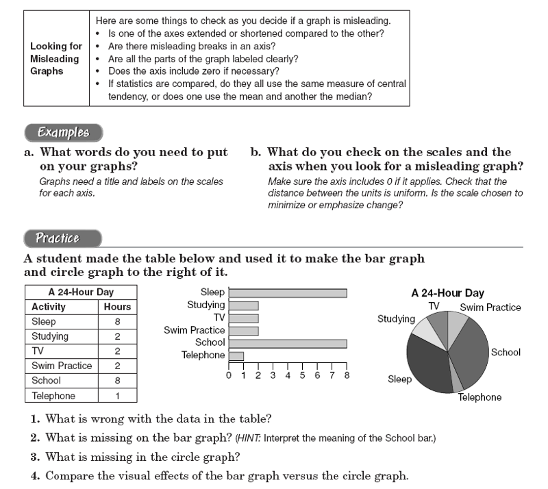
1. What is wrong with the data in the table? The total hours should add to 24 hours, but it only adds to 23 hours.
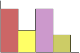
2. What is missing on the bar graph? There is no title for the graph and no labels on both axises.
3. What is missing in the circle graph? In the circle graph, the size of the pie should be labelled.
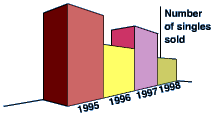
A 3D bar chart might look very attractive, but it is often quite misleading. Note the 3-D bar chart on the left below, because of the perspective it looks as though the sales for 1995 were far greater than those for any other year. In fact they were identical to those for 1997. It would be much better to draw a 2D bar chart.
The following list of questions help us work through potential presentation bias in a study:
Presentation Bias - is the study presented in a way that could be easily misinterpreted?
Overall assessment of presentation bias: _____ Low _____Moderate ____High
Explain:
Check the correct answers for question 2&3 below:
Key to question #2:
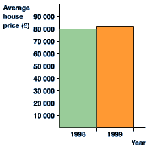
from this graph it looks as though house prices have tripled in one year! It is misleading because the vertical axis does not start at 0. Look at the 'improved' version of the same graph. This gives a much more accurate picture of what has happened. Corrected graph should look like below:
Key to question #3:
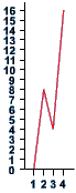
Although the vertical scale starts at 0, it does not go up in even steps. This has the effect of distorting the graph, and making it look as though the biggest jump is between 1 and 2 rather than 3 and 4. Also, there are no labels on the axes. We have no idea what this graph represents! If the scales are correct, the graph should look like below: