Practical Skills - How to create a scatter plot using Epi Info
The following video shows you how to create a scatter plot using Epi Info. I have also included written instructions below for your reference.
![]()
To create a scatterplot using Epi Info (we will use "Arsenic in Toenails Dataset" as an example),
- Under "Statistics", click on "Graph"
- Under the "Graph Type" window, click on the dropdown arrow and select "Scatter"
- Under the "Title" window, type in the title you want to name your chart (for example, "Arsenic in Toenails").
- Under the "Independent Axis Label" window, type in name of the independent variable with unit, in our example, it is "As in water (PPB)" (since the amount of As in water one consumes (i.e. potential causal factor/independent variable) will influence or make a difference on amount of As in one's toenails (i.e. outcome/dependent variable)
- Under the "Dependent Axis Label" window, type in name of the dependent variable with unit, in our example, it is "As in Nail (PPB)" (reason see above)
- Under the "Main Variable(s)" window, click on the dropdown arrow and select the Independent variable first and then the Dependent variable. So in the space below the "Main Variable(s)" window, the independent variable should always be the one on the top. In our example, we should first select "ASWATER" followed by "ASNAIL" since ASWATER is the independent variable and ASNAIL is the dependent variable. In the space below the "Main Variable(s)" window, "ASWATER" is on the top.
- Click "OK"
- A scatterplot (with linear regression line) will show up in the output area and on the top right corner there are icons allow you to either save or print image.
Practical Skills - How to Generate Regression Statistics (Slope and Intercept) using Epi Info
The following video shows how to generate regression statistics (slope and intercept) using Epi Info. I have also included written instruction below for your reference.
![]()
To generate regression statistics (i.e., slope and intercept) for measure of associations between two quantitative variables, we need to do the following (we will use "Arsenic in Toenails Dataset" as an example):
- Under "Advanced Statistics", click on "Linear Regression".
- Under the "Outcome Variable" window, click on the dropdown arrow and select the dependent variable. In our example, this would be "ASNAIL" because the amount of arsenic in one's toenails is the outcome of interest for our problem here.
- Under the "Other Variables" window, click on the dropdown arrow and select the independent variable. In our example, this would be "ASWATER" because the amount of As in water one consumes (i.e. potential causal factor/independent variable) will influence or make a difference on amount of As in one's toenails (i.e. outcome/dependent variable.
- Then click "OK"
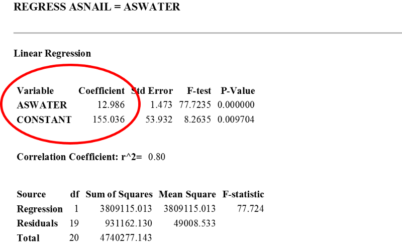
- Under the heading "REGRESS ASNAIL = ASWATER", you will see a title "Linear Regression" followed by a table as shown below. The part we have to focus on is circled by red. Note the coefficient for the independent variable (i.e. ASWATER) is the regression coefficient/slope (i.e. 12.986), and the coefficient for CONSTANT (i.e. 155.036) is the intercept.
Practical Skills - How to generate a scatter plot, regression statistics (i.e. slope and intercept) using EXCEL
The following video show you how to generate a scatter plot and regression statistics including slope and intercept using EXCEL. I have also included written instruction below for your reference.
![]()
- To make a scatter plot and regression statistics including slope and intercept using EXCEL, do the following:
- Highlight the dataset with X-variable (the independent variable) on the left and Y-variable (dependent variable) on the right. In this example, "ASWATER" is considered the independent variable and "ASNAIL" is the outcome variable (i.e. dependent variable).
- Click on "INSERT", and then click on "Scatter with only Markers" option
- Highlight the datapoints on the scatterplot by click on any datapoint (you may have to try a couple of times to make sure most of datapoints are highlighted), then right click on the mouse
- Then click on "ADD TRENDLINE ".
- In the "FORMAT TRENDLINE" window, Under the "TRENDLINE OPTIONS",
- Check the box next to "DISPLAY EQUATION ON CHART", then click "CLOSE".