Lesson Seven
Measures of Association (MOAs) for Quantitative Data - Finding Connections betwen Variables
After successfully completing this lesson, students should be able to:
1.Calculate and interpret MOAs when one variable is quantitative and the other variable is nominal.
2.Generate MOAs when one variable is quantitative and the other variable is nominal using Epi Info.
3.Interpret and predict impact of MOAs when both variables are quantitative.
4.Generate MOAs when both variables are quantitative
To find "causes" we look to our data for connections between an independent variable (factor) and a dependant variable (outcome or problem). But how will we see this in our data? The answer is Measures of Association. That is, a measure of the association between the two variables. In this learning module, we will discuss how to analyze data to discover connections when one or both variables are quantitative data.
It is important to note that all of the discussion that follows assumes we have eliminated alternative explanations for observed associations between variables, so we can be reasonably confident the associations are causal. This point will be covered in more detail later in the course.
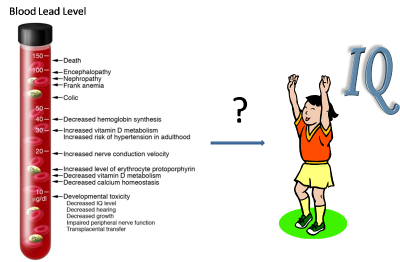
If we are concerned, for example, that exposure to lead may cause a drop in intelligence in children, then we might do a study to see if children exposed to lead have a lower IQ than those who are unexposed. But, how will the connection between IQ and lead exposure be evident in our data? Assume that in our study we identify whether each child has a blood lead concentration above 20 ug/dL, and we also determine the child's IQ with a psychological test.
Assume the results are as follows:
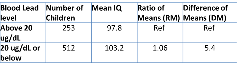
Table 1. Ratio of Means and Difference of Means for IQ and Blood Lead Level in children.
| Blood Lead level
|
Number of Children |
Mean IQ |
Ratio of Means |
Difference of Means |
|
Above 20 ug/dL |
127 |
98.2 |
Ref |
Ref |
|
20 ug/dL or below |
452 |
102.1 |
1.04 |
3.9 |
Note that we begin by calculating the mean IQ among each group of children. The mean IQ is higher in the low-lead group, though it is difficult to know the clinical significance of this difference without some medical consultation. Nevertheless, we'd like to more clearly understand the magnitude of this difference.
One way to do this is a ratio of the two means (RM), using the high-lead group as the reference group, we can calculate RM to be 102.1/98.2, or 1.04. We interpret this as:
The average IQ of children with blood lead levels of 20 ug/dL or below is 1.04 times as high as (or 4% higher than) children with blood lead levels above 20 ug/dL.
Note reference group refers to the group in the denominator in calculating RM. In another word, when calculating RM, we need to put the average of the rerferencve group in the demoniator. Once a group is used as a reference group, we don't need to calculate RM for that group.
Alternatively, we could subtract the means instead of dividing them, to produce a Difference of Means (DM). Using the high-lead group as the reference group, we can calculate DM to be 102.1 - 98.2, or 3.9.
We could interpret it as follows:
The average IQ of children with blood lead levels of 20 ug/dL or below is 3.9 IQ points higher than children with blood lead levels above 20 ug/dL.
In calculating DM, the reference group refers to the second term/group in subtraction. In another word, when calculating DM, we need to put the avarege of the reference group as the second term in subtraction. Once a group is used as a reference group, we don't need to calculate DM for that group.
A study was conducted to examine the relationship between a child's blood lead level and a child's IQ score. Results are summarized in the table below (Note the group of blood lead level of above 20 ug/DL is used as the reference group).
Based on above table, answer the following questions:
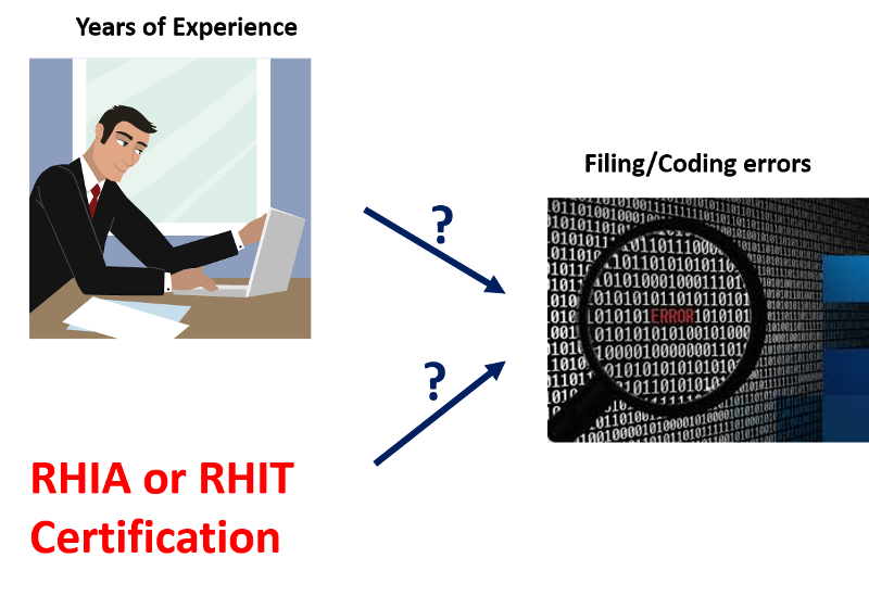
You direct the medical records unit in a medium-sized hospital. You are concerned about the number of errors that are made in the unit when filing/coding diagnoses and procedures. In order to determine the best corrective action to take, you collect information for each of your employees on the number of filing/coding errors made in the last month, whether the employee is a Registered Health Information Administrator (RHIA) or Registered Health Information Technician (RHIT), and the number of years of experience in filing/coding.
Your data are below in Table 2.
TABLE 2: Filing errors last month, RHIA/RHIT status, and years of experience for 12 medical record employees, Wilted Lilly Hospital, June, 2013.
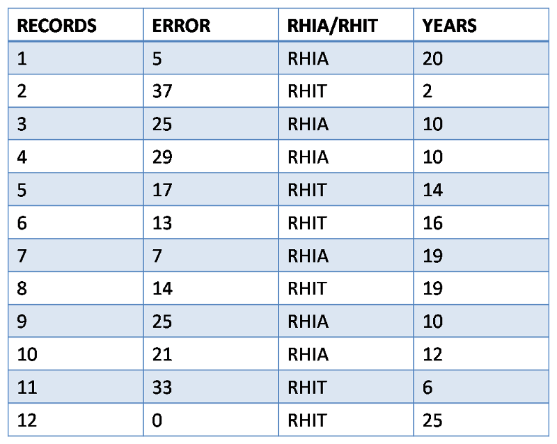
ERROR=number of filing/coding errors in month (per 1000 records), RHIA/RHIT=certification held, YEARS=years of filing experience.
In order to test if certification and years of experiences are potential causes for coding errors, we have to:
For Task #1, What kinds of MOAs should we use here? Well, Certification is a nominal variable while filing errors is a quantitative variable, so we should use Difference in Means (or medians) or Ratio of Means (or medians)
For Task #2, What kinds of MOAs should we use here? Well, Years of experience is a quantitative variable and filing errors is a quantitative variable, we can't use DM, RM, RR, AR, or AP. We will have to use a new MOAs called regression coefficient or slope and we will discuss it in detail later in this lesson.
Now Let's complete Task #1. Remember we need to examine difference in means (or medians) or ratio of means(or medians), so we first we need to find out mean and median filing error for each certification.
For RHIA certification, filing errors (per 1000 records) are: 5, 25, 29, 7, 25, 21; mean =18.7; median = 23
For RHIT certification, filing errors (per 1000 records) are: 37, 17, 13, 14, 33, 0; mean = 19; median = 15.5
Notice mean and median for each certification are quite different (18.7 vs 23; 19 vs 15.5), indicating a skewed distribution. Remember in Lesson 5, we have discussed that for skewed distribution, median is a better measure to use than mean? So in this case, we should use Difference in Median or Ratio of Median and presented following the format of Table 1.
| Certification
|
Number of Employees |
Median Filing Errors (per 1000 records) |
Ratio of Medians |
Difference of Medians |
|
RHIA |
6 |
23 |
1.48[1] |
7.5[2] |
|
RHIT |
6 |
15.5 |
Ref |
Ref |
Note the group of RHIT is used as the reference group.
[1]: 23/15.5 = 1.48
Interpretation: The average filing errors made by employees with RHIA certification is 1.48 times as high as (or 48% higher than) that by employees with RHIT certification.
[2]: 23-15.5 = 7.5
Interpretation: The average filing errors made by employee with RHIA certification is 7.5 errors (per 1000 records) more than that by employee with RHIT certification.
Based on above results, we can see that types of certification one receives do appear to be associated with filing errors.
Another important point to keep in mind is that Difference of Means and Ratio of Means can be replaced with Difference of Medians or Ratio of Medians depending on the distribution of the quantitative variable.
To examine the potential causes of filing errors, data on the number of filing errors (per 1000 records) made in the last month, whether the employee is a RHIA or RHIT, and the number of years of experience in coding are collected and presented below:
Based on the above table, answer the following questions:
Assuming the following results are obtained after analyzing the above data (Note RHIT is used as the reference group):

Based on the above table, answer the following questions:
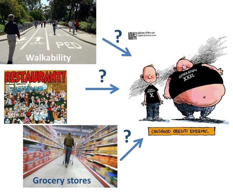
You are a environmental health specialist for Big Weight County Health Department. Needs assessment has indicated childhood obesity is a major problem in your county. As a matter of fact, childhood obesity is a new epidemic for our country. Check out the video below for some background information.
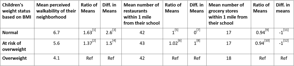
The director of your department learned from other county health departments that community environment such as perceived walkability or number of restaurants/grocery stores could help reduce obesity. Before he submits a proposal to the mayor about changing community environment, he wants you to check on the latest research that examines the relationship between community environment variables and childhood obesity and to give him suggestions on what community environment characteristics should be changed.
Below is the newest research you came across*:
A total of 45 public elementary schools from nine school districts with a total of 1624 children were recruited for the study. Measured child weight and height were obtained by trained evaluation assistants using portable scales and stadiometers, respectively. Body mass index (BMI) was calculated based on weight and height. Community environment variables measured include:
* Modified from Journal of School Health, January 2010, Elder, J. P. et al. "Individual, family and community environmental correlates of obesity in Latino Elementary School Children".
To assess perceived walkability, a modified version of the US Department of Transportation, Partnership for a Walkable American, Pedestrian and Bicycle Information Center and the United States Environmental Protection Agency's Walkability Checklist was used. Ten questions assessed perceived neighborhood safety/aesthetics, including the presence of crime, lights, and vehicle exhaust in the neighborhood. The final model included a summarized score assessing perceived neighborhood walkability with the maximum score of 10 points and minimum score of 0 points). The number of restaurants and grocery stores within 1 mile from school are analyzed using GIS.
Table 1. Perceived walkability of neighborhood, number of restaurants and grocery stores and children's weight status (Partially fictitious)
Note the group of overweight is used as the reference group.
[1] 6.7/4.1 = 1.63; The average perceived walkability of normal-weight children's neighborhoods is 1.63 times as great as that of overweight children's neighborhoods.
[2] 5.6/4.1 = 1.37; The average perceived walkability of at-risk-of-overweight children's neighborhoods is 1.37 times as great as that of overweight children's neighborhoods.
[3] 6.7 - 4.1 = 2.6; The average perceived walkability of normal-weight children's neighborhoods is 2.6 points greater than that of overweight children's neighborhoods.
[4] 5.6 - 4.1 = 1.5; The average perceived walkability of at-risk-of-overweight children's neighborhoods is 1.5 points greater than that of overweight children's neighborhoods.
[5] 42/42 = 1; The average number of restaurants within 1 mile from normal-weight children's schools is the same as that from overweight children's schools.
[6] 43/42 = 1.02; The average number of restaurants within 1 mile from at-risk-of-overweight children's schools is 1.02 times as great as that from overweight children's schools.
[7] 42-42 = 0; The average number of restaurants within 1 mile from normal-weight children's schools is the same as that from overweight children's schools.
[8] 43-42 = 1; The average number of restaurants within 1 mile from at-risk-of-overweight children's schools is one more than that from overweight children's schools.
[9] 17/18 = 0.94; The average number of grocery stores within 1 mile from normal-weight children's schools is 0.94 times as great as that from overweight children's schools.
[10] 17/18 = 0.94; The average number of grocery stores within 1 mile from at-risk-of-overweight children's schools is 0.94 times as great as that from overweight children's schools.
[11] 17-18 = -1; The average number of grocery stores within 1 mile from normal-weight children's schools is one less than that from overweight children's schools.
[12] 17-18 = -1; The average number of grocery stores within 1 mile from at-risk-of-overweight children's schools is one less than that from overweight children's schools.
Based on above results, we can see:
Therefore, we can conclude only the perceived walkability of a child's neighborhood is connected with a child's weight status. Number of restaurants or number of grocery stores within 1 mile from a child's school do not seem to be connected with a child's weight status. So based on this study, what community environment characteristics should be changed to reduce childhood obesity? Perceived walkability!
Case #1. A study was conducted to examine the perceived walkability of a child's neighborhood, number of grocery stores within 1 mile from a child's school and a child's weight status, results are summarized below (Note the group of overweight is used as the reference group):

Based on above table, answer the following questions:
In terms of grocery stores with 1 mile from a child's school;
Case #2: You work with a small rural hospital. The hospital is losing nearly 50% on its Medicare patients due to extremely long length of stays (LOS). You believe it may be due to individual practices of the three community physicians and due to age of the patients. You randomly select 10 cases from each physician and collect information on LOS and age of patient. Your results are in Table 3 below. To what extent does physician or age appear to be related to LOS?
TABLE 3: Length-of-stay, physician, and age of patient for 30 patients at ACME Hospital , 2013.
REC=subject number, LOS=length of stay (days), DOC=physician, AGE=patient age in years
The following four questions are based on the table below which summarized the relationship between physician and Length of stay (LOS) in days (Note physician B is used as the reference).
The following video shows how to compare means/medians of multiple groups using Epi Info. I have also included written instruction for your reference below.
To compare means/medians of multiple groups (i.e. MOAs when one variable is quantitative and one is categorical), we need to use the "MEANS" command. For example, for the SSI dataset, let's say we want to compare "SURGEXP" (a quantitative variable) for cases that are infected with cases that are not infected. To do this:
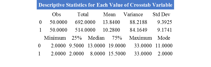
Remember for variable "INF", 0 - No and 1 - Yes. So from the table, we can obtain the following results:
Mean surgerical experience for "not infected" group = 13.84; Mean surgerical experience for "infected" group =10.28
Median surgerical experience for "not Infected" group = 13.00; Median surgerical experience for "infected" group = 8.0.
How should we analyze data to discover connections between two quantitative variables? Let's start with an professional scenario.
Let's go back to the scenario about medical records unit in a hospital. You are concerned about the number of errors that are made in the unit when filing/coding diagnoses and procedures. In order to determine the best corrective action to take, you collect information for each of your employees on the number of filing/coding errors made in the last month (per 1000 records filed), whether the employee is a RHIA or RHIT, and the number of years of experience in filing/coding. In the previous section, we have discussed how to evaluate the relationship between certification and filing/coding errors. In this section, we will discuss how to evaluate the relationship between years of experience and filing/coding errors.
Since both variables (i.e., "years of experience" and "Filing errors (per 1000 records filed)" are quantitative, we start by making a scatter plot of the data, see Figure 1 below. Notice "Years of experience" is plotted as the X-axis (i.e. the independent variable) and "Filing errors (per 1000 records filed)" is plotted as the Y-axis (i.e. the dependent variable). It is important to remember that we always plot the issues or outcomes (i.e. dependent variable) as the "Y-axis" (in this case, "filing errors (per 1000 records filed)" certainly is a problem so it is ploted as the Y-axis) and we plot potential causal factor (i.e. independent variable) as the X-axis (in this case, "years of experience" is speculated as a causal factor affecting the number of filing errors made).
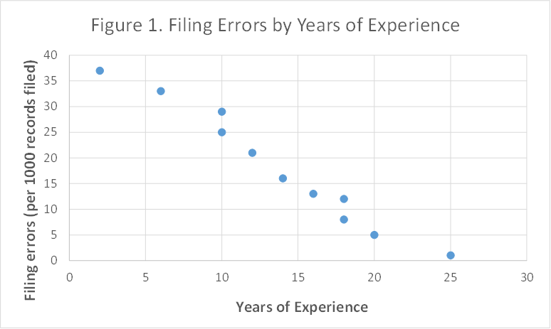
The data suggest a downward (negative) relationship. That is, the more years of experience, the fewer errors are made. These data points all clustered around a line suggesting a linear relationship, so we could try to draw a line through the data, trying to get the best "fit". However, we can use the computer to fit the line for us, using linear regression analysis. The process fits the line and calculates the equation of that line that minimizes the scatter of points around the line. The results, using Microsoft Excel, are presented in Figure 2 below.
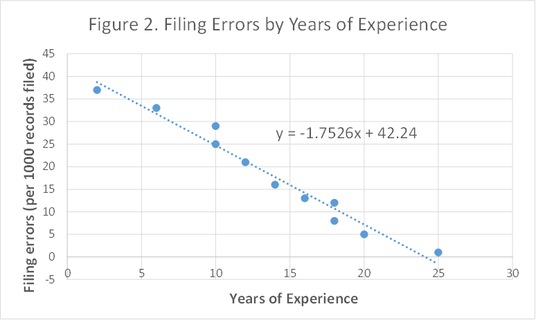
The equation of the line follows the general form of
y = mx + b
where:
m=slope
b=intercept.
Recall that intercept is the value of Y when X is zero and slope (also called the regression coefficient) is the change in Y when X increases by one unit. In the above case of filing errors, the intercept of 42.24 tells us that, on average, someone with zero years of experience is most likely to make about 42 filing errors per 1000 records filed. Now let's try to interpret the regression coefficient/slope:
1) First, we need to figure out what does "X increases by one unit" mean in this setting.
X-variable in this case is "years of experience". So when "X increases by one unit", it means "years of experience increases by one (year)".
2) Second, we need to find out the "change in Y" (i.e. "Y will change by _____(the regression coefficient)" when X increases by one unit in this setting.
Y-variable in this case is "Filing errors (per 1000 records filed)". From the graph, we can see that slope/regression coefficient is "-1.7526", then "change in Y" or "Y will change by ____(the regression coefficient)"
in this setting would mean "Filing errors will change by -1.7526 errors (per 1000 records filed) (i.e. decrease by 1.7526 errors (per 1000 records filed)".
Connecting 1) and 2) together, we can interpret the regression coefficient as following:
When years of experience increases by one (year), filing errors will change by -1.7526 errors (per 1000 records filed) (or decrease by 1.7526 errors (per 1000 records filed)).
Note:
A "+" regression coefficient means "Y increase by (or change by) a positive amount when X increases by one unit".
A "-" regression coefficiednt means "Y decrease by a positive amount (i.e. Y change by a negative amount) when X increases by one unit".
Of these two values, the slope/regression coefficient is usually more important, since it tells us how much we might be able to improve the situation (i.e. Y-variable) if we can change the independent variable (x).
For example, in the above case, what would be the impact on filing errors if years of experience increases from current 5 years to 10 years?
When years of experience increases by one (year), filing errors will change by -1.7526 errors (per 1000 records filed) (i.e. decrease by 1.7526 errors (per 1000 records filed))
When years of expereince increases from current 5 years to 10 years (change in X-variable = Xfuture - Xcurrent = 10 - 5 = 5 years), filing errors will change by = -1.7526 x 5 = - 8.763 errors (per 1000 records) (i.e. decrease by 8.763 errors (per 1000 records)).
In general, we can apply the following formula to predict change in Y-variable using regression coefficient:
Change in Y-variable = Regression coefficient x (Change in X-variable) = Regression coefficient x (Xfuture - Xcurrent)
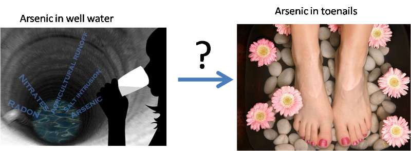
You work with a rural health department. Many rural wells have moderate to high levels of arsenic, yet is uncertain how much personal exposure is actually occurring as a result of this water contamination. It would be very helpful to know if people's arsenic exposure were actually related to the level of arsenic in their drinking water.
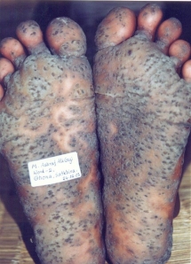
Skin lesions from long-term high level of arsenic poisoning. To learn more about arsenic poisoning and possible exposure, you may watch the videos below:
Arsenic in Bangladesh (Note you can select full screen if you want)
Arsenic concerns in the U.S. (Note you can select full screen if you want)
There is good scientific reason to believe that the level of arsenic in toenails is a good indicator of overall arsenic exposure. You decide to examine whether there is a relationship between the concentration of arsenic in people's drinking water and the concentration of arsenic (As) in their toenails. Twenty-one participants were interviewed regarding use of their private (unregulated) wells for drinking and cooking, and each provided a sample of water and toenail clippings for arsenic (As) analysis.
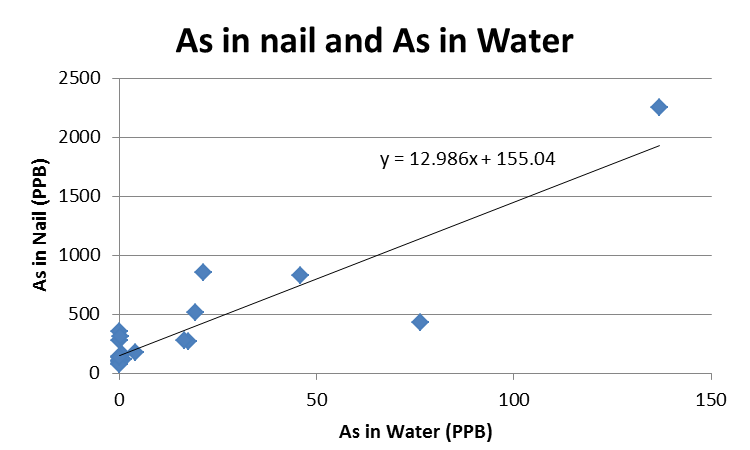
The most important finding is presented below (on the last page of this lesson, there is a video showing how to make the chart below).
Based on the finding, answer the following four questsions:
SOLUTION:
Answer to Question #1:
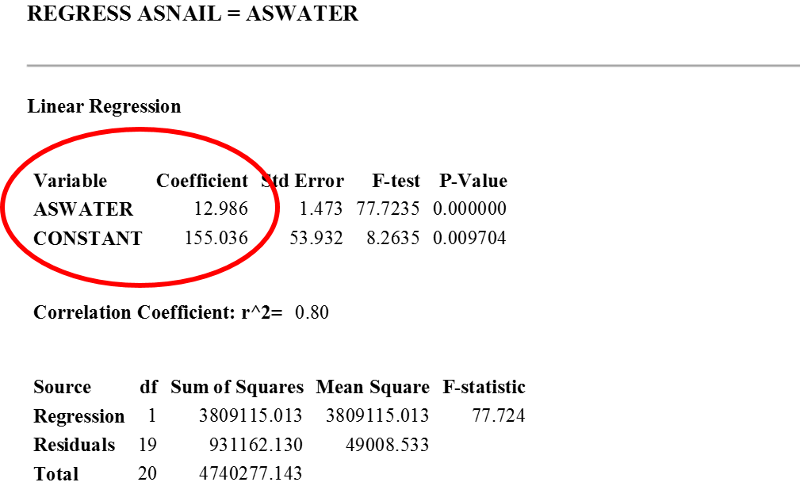
From the scatterplot, we can see that As in nail is positively correlated with As in water, i.e., the higher level of As in water, the higher level of As in nail. The slope of the line is the regression coefficient: 12.986. To interpret this regression coefficient,
1) First, we need to figure out what does "X increases by one unit" mean in this setting.
X-variable in this case is "As in Water (PPB)". So when "X increases by one unit", it means "As in water increases by 1 PPB".
2) Second, we need to find out the "change in Y" (i.e. "Y will change by _____(the regression coefficient)" when X increases by one unit in this setting.
Y-variable in this case is "As in nail (PPB)" and regression coefficient is "12.986", then "Y will change by ____(the regression coefficient)" in this setting would mean "As in nail will change by 12.986 PPB".
Connecting 1) and 2) together, we can interpret the regression coefficient as following:
When As in water increases by 1 PPB, As in nail will change by 12.986 PPB
Answer to Question #2: When As in water changes from current 1 PPB to 0.5 PPB, As in nail will change by = regression coefficient x (Change in X-variable) = 12.986 x (0.5 - 1 PPB) = - 6.5 PPB (i.e. decrease by 6.5 PPB)
Answer to Question #3: When As in water changes from current 1 PPB to 0.1 PPB, As in nail will change by = regression coefficient x (Change in X-variable) = 12.986 x (0.1 - 1 PPB) = -11.7 PPB (i.e. decrease by 11.7 PPB)
Answer to Question #4: When water As concentration changes from current 1 PPB to 0.2 PPB, As in nail will change by = regression coefficient x (Change in X-variable) = 12.986 x (0.2 PPB - 1 PPB) = -10.4 PPB (i.e. decrease by 10.4 PPB); Nicole's current As nail level is at 15 PPB, and according to the model, her future As nail concentration should be = Current As in nail level + "As in nail change by" = 15 PPB + (-10.4 PPB) = 15 PPB - 10.4 PPB = 4.6 PPB.
In general, we can apply the following formula to predict future Y-variable:
Yfuture = Ycurrent + Regression coefficient x (Xfuture - Xcurrent)
Case #1. A study is conducted to evaluate the relationship between Arsenic in nail (PPB) and As in water (PPB), results are presented below:

Based on above chart, answer the following questions:
Case #2. You are a health educator for a large local health department where coronary heart disease has been a major problem for your community. To educate public on various ways to reduce total cholesterol, you came across the study shown below.Total cholesterol levels were determined for 51,723 participants of community-based cholesterol screenings in 10 United States cities during 2013. Through linear regression, total cholesterol levels (mg/dL) (Y) was found to be associated with number of cigarettes smoked per day (cigarette/day) (X) for both men and women under the age of 60.

Results of regression analysis are summarized below:
|
Gender |
Regression coefficient b, (mg/dL)/[cigarette/day] |
|
Men aged 18 through 60 |
0.33 |
|
Women aged 31 through 60 |
0.48 |
Based on above study, answer the following questions:
The following video shows you how to create a scatter plot using Epi Info. I have also included written instructions below for your reference.
To create a scatterplot using Epi Info (we will use "Arsenic in Toenails Dataset" as an example),
The following video shows how to generate regression statistics (slope and intercept) using Epi Info. I have also included written instruction below for your reference.
To generate regression statistics (i.e., slope and intercept) for measure of associations between two quantitative variables, we need to do the following (we will use "Arsenic in Toenails Dataset" as an example):
The following video show you how to generate a scatter plot and regression statistics including slope and intercept using EXCEL. I have also included written instruction below for your reference.